
University websites frequently fail to meet the needs of their audiences.[1–8] Focusing on the University of North Texas, the following proposal posits that the ecosystem and institutional culture surrounding the web within UNT's colleges and academic departments lead to its own poor website experiences.
To attempt to address these issues within the constraints of UNT's current ecosystem, current culture, and current budgeted resources, this proposal recommends implementing an onboarding process for people who own an academic department website. This onboarding process should ask the website owner to set specific goals, such as “recruit more graduate students,” and provide actionable recommendations to achieve and measure the on-going success of these goals.
Ideally, this onboarding process will help departments prioritize the work they do on their websites, given the constraints on their time and resources. However, the ultimate intent of this onboarding process would be to influence the culture around websites at UNT—to reframe how departments think about and approach their websites.
University websites are a leading resource for both prospective and current students. Recent research by UniQuest, a UK conversion optimization agency that focuses on student recruitment and retention, found “that for a staggering 50% of enrolled students, the university website wasn’t just the most important channel. It was the only channel used.”[9]
Students use university department websites to gather specific information and complete critical tasks, such as:
However, despite their critical role in modern academia, these websites are notoriously poor at meeting their audience's needs.[1–8] Usability expert Katie Sherwin writes, “It's an empirical fact derived from observing many prospective students using many university sites that these users are often frustrated or thwarted by the frequent usability problems on university sites. The best university websites speak clearly, even to yet-to-be students, and make it easy for everybody to find what they want. The rest fail.”[1]
By failing to meet these needs, students may graduate later, graduate with more debt, drop out, or choose a different school altogether. Ultimately, this means poor website experiences may lead to suboptimal outcomes for the university in the form of lost funding, labor, research, or other resources—the very opposite of what the university hopes to achieve via its websites.
A myriad of causes contribute to these poor experiences—some universal and some specific to higher ed. These causes make up the culture and ecosystem we'll explore. The primary drivers of these poor website experiences and outcomes at UNT are:
These core reasons are multiplied by a lack of resources and designated authority dedicated to improving the overall website ecosystem. In other words, by making or allowing departments to control their own web presences—with minimal web resources, skills, or knowledge—no one is accountable for how well these websites meet student needs. As a result, success is most often measured by how much departments like or positively perceive their websites instead of how well they accomplish specific institutional goals.[10]
Due to decentralized accountability, websites at UNT are created in the image of the organizational structure of the university—a phenomenon best described by Conway's Law: "Organizations which design systems [...] are constrained to produce designs which are copies of the communication structures of these organizations."[11] Put another way, this means that instead of organizing websites and their information architecture around student tasks and mental models, each college, school, department, program, or initiative has its own website.
Each of these websites at UNT usually has a single website owner who is ultimately responsible for the content of that website. This owner may be the one editing the website as well, but frequently, the owner delegates these tasks to a website editor—sometimes there may be more than one editor per website.
Both owners and editors usually have little to no experience with web design, development, or content strategy. In almost all cases, maintaining a website is unrelated to their main occupation at the university.
Web developers are usually tasked with facilitating a collection of website editors via maintaining a content management system for them. Put simply, this means that web designers and developers at the university provide tools to website editors—they usually do not create, maintain, or organize content.
Some of these developers support hundreds of websites, while some support just a handful. The former are usually incentivized to keep their collection of websites easy to support by standardizing their templates and content management system—the latter are usually employed by individual colleges or departments to do bespoke design and programming. Additionally, developers and designers are embedded in various areas and at various levels of the university with little connection to one another.

This group is generally responsible for creating templates, managing the content management system, and training website editors on how to update their websites. They tend to be embedded in either marketing or IT organizations, though they may occasionally report directly to a dean or other leadership. Their primary role in the current ecosystem is to facilitate website owners and editors while balancing their own workload, resources, and policy compliance.

For academic websites, website owners are usually deans, chairs, and directors of academic organizations within the university. Within the current ecosystem, they are usually the final authority on the structure of their websites. Sometimes this includes directing the visual design and layout of the website within the templates provided by the web developer group, but most frequently it means they determine their website's information architecture and content—or they delegate those decisions to faculty committees or individual website editors.

Sometimes this group overlaps with the website owner group. However, most often, this group is comprised of office and administrative assistants within the department that owns the website—with the occasional graduate student. Sometimes they operate independently with little guidance from an owner, while others may only perform web-related tasks at the direction of the website owner. Their knowledge and skills on web, design, and content varies widely.

The primary users of UNT's academic websites are students, both prospective and current. The siloed nature of the website ecosystem combined with a lack of accountability for measuring if the websites meet student's needs can result in a disjointed and confusing experience—students are usually unaware of the organizational structure of the university or its jargon.[12]
“Typically, stakeholder goals are only achieved when users can accomplish whatever it is that brought them to the site in the first place.” [13]
Why do people visit websites? Jakob Nielsen wrote in 1999 that website visitors "want immediate support for their own goals. Even so, most websites are slow, internally-driven, and do not focus on solving the users' problems."[14]
In another article, Nielsen describes how the web is different from other traditional marketing mediums like TV and print: "[The Web] is a user-driven experience, where the user is actively engaged in determining where to go next. The user is usually on the Web for a purpose and is not likely to be distracted from the goal by an advertisement (banner blindness is one of the main reasons click-through is so low). This active user engagement makes the Web more cognitive, since the user has to think about what hypertext links to click and how to navigate. This again makes the Web less suited for purely emotional advertising. The user is not on the Web to ‘get an experience’ but to get something done. The Web is not simply a ‘customer-oriented’ medium; it's a customer-dominated medium."[15]
In contrast to this, academic departments create and maintain their websites most often as a way of promoting not only their degree programs, but their accomplishments, news, events, research, donors, and additional internally-focused concerns. Unfortunately, it's common for all kinds of businesses—not just universities—to misunderstand how the interactive nature of the web shapes how people use it.
The vast majority of visitors to UNT's academic websites are not visiting to read departmental news, view faculty and student accomplishments, or otherwise be overtly marketed to. Do not mistake this as an argument that these concerns are unimportant. Effective branding, promotion, and storytelling are important, and when used well, at the right times, in the right places, with the right audiences, they can strengthen the brand of departments and institutions both internally and externally. However, years of analytics on over 50 academic websites at UNT combined with what we know about how people use the web both tell us that visitors almost always ignore this content on the websites. Students aren't going to the website for the reasons the department maintains the website.
Luke Wroblewski describes this as “the gap between what something is and why it exists,” and cautions that the gap widens “when people start to do things for reasons other than the customer.”[16] In other words, the less we align student goals with university goals, the less value we get out of the already limited institutional resources devoted to the websites.
The following groups of quotes are from website owners, website editors, and students using those websites. The first set of quotes are pulled from emails and tickets I've received from both website owners and website editors at UNT. The second set of quotes are pulled from a 2016 intercept survey I conducted on the websites we support—the quotes are from students who were actually using the websites when asked to complete the survey.
Common themes begin to emerge from each group. Departments are often concerned with their image on the web and view their websites as traditional marketing pieces. Students, however, are concerned with gathering information or completing specific tasks related to their goals. These two sets of concerns are frequently at odds with one another.
I would really like our webpage to be visually appealing, as well as user friendly. My hope is that students use it as a hub for all their resources and enjoy using it, but right now I just have it in list format. I was hoping the picture icons and interactive component could give it a creative quality.”
[Our faculty] want to be proud of our site.”
I am trying to update [our website], but I'm pretty limited in what I can do. [...] I would also like to know if I can take some creative liberties.”
I would like to point to [a website] that has a ‘news’ option that I would LOVE to see as a layout. [...] Do you think we could have something like this?”
[We] have an awesome video we would like to add to our site. Where would be the best place to add this to our [website] and how would I go about doing this?”
Is there going to be a way for us to have a slide show on our front page? We would really benefit from that given that our programs are so visually based.”
What I don't like [about the UNT template] is having so much content below the fold. I'm concerned that readers won't scroll down far enough, or that they won't click through to the information they need.”
We are attempting to make our website a bit more user friendly, and would like for the following adjustments to be made, please. 1. [...] Enable an actual calendar to show the events [...] We [also] want an archive of events. 2. Would you please enable the ability to archive stories? [...] 3. Lastly, please, enable video to be used in [these pages.] Thank you in advance for [...] making our efforts to attract, engage, and inspire students happen.”
[Our director] would like to be able to add something at the top of the front page of our website that alerts visitors about a major upcoming event we have.”
We would like to know if it's possible to move our news section up so that it's [...] above all the white boxes with the program info on it [on the home page].”
Too much visual [information] such as photos—all this visual info is irrelevant—[the website needs] to allow people to easily get to the point. Very difficult to use and find info. Too many layers to go through to find what I'm looking for.”
I want to quickly and easily find information without looking at tons of meaningless photographs and without going through multiple layers.”
Why on earth is it not updated with summer hours? Seems like it is designed to look flashy. Doesn't appear functional.”
Just difficult to maneuver through to find what I needed. Would love PDF documents with [lists] of courses needed with [descriptions].”
I cannot find a list of classes for the different choices.”
[I was trying but could not find] what programs are offered.”
[The most important feature to me is] up-to-date information.”
UNT has the worst website imaginable. [I was] just trying to find a course description.”
[I was] trying to see degree plans for various combinations of selections.”
[I could not find] which audit was required if I'm just changing majors.”
[I wanted to learn about] careers I can get through [this degree program] other than academia, or just career opportunities in general.”
What the department offers, news, how to schedule advising, and a step by step list for graduate students so they stay on track throughout their program [are most important to me].”
“Clear content, simple navigation and answers to customer questions have the biggest impact on business value. Advanced technology matters much less. [...] Average users just want to complete tasks online.” [17]
The following data is a year's worth of analytics from one of UNT's college websites. It's another salient example of misaligned goals between departments and students: it shows the amount of effort spent on certain types of web pages compared with the most frequently visited pages.
While there are potential flaws with this comparison—some types of content may need less editing regardless of how much they're used, and page hits are not a direct indication of business value—it's still a useful illustration of this misalignment between the effort universities spend on their websites with what students actually do on those websites.
By exploring the current website ecosystem at UNT and the roles within it, website owners emerged as a focal point. Given that website owners are usually the final authority on what content is on their websites—not the developers or editors—it's vital to understand their goals, needs, motivations, and behaviors to get a clearer picture of the problem we're trying to address.
The following section contains personas and describes the experience of creating and owning an academic website. The intent of this user research is to identify alignment between what motivates website owners and what methods could improve the current ecosystem and culture, constraints and all.
I crafted the following website owner personas by reviewing a decade of emails and communication with them in my role as Senior Web Manager at UNT, as well as piecing together information from conversations and informal interviews from various roles within the university. Since many website owners are department chairs, I supplemented my knowledge by reading chair handbooks from a variety of universities to get a better sense of their responsibilities and pressures.
Two main types of personas unfolded: outcome-focused owners and identity-focused owners. These personas are amalgamations—they are not representative of any one department. Instead, they represent observed common sets of motivations and behaviors.
Outcome-focused owners typically sense that their websites are tools that can achieve specific business goals, but they may or may not truly align their website's value with student goals. Identity-focused owners perceive their websites as a method of conveying the character or brand of their department, often as a well-intentioned method of recruitment. Both personas usually view their websites as promotional channels above all else.
It's important to note that while the following two personas are department chairs, it's not uncommon for a chair to delegate all responsibility to their website editor—usually an administrative assistant in the department. This editor-in-lieu-of-owner comes with their own set of needs, motivations, and behaviors which should be explored in future research.
Dr. Margaret Crawford, 54
PhD from the University of Chicago, 1999
Department chair
Dr. Daniel Roman, 51
PhD from the University of Texas, 1995
Department chair
The current experience of owning and editing an academic website within UNT is missing some crucial steps. Most often, websites are wanted, created, and edited without fully researching or understanding either audience needs or what organizational goals websites fulfill best.
The personas outlined in the previous section—Dr. Crawford, Dr. Roman, and their administrative assistants—work on their websites with the best of intentions, but are frequently unaware of the impact of their decisions. Our personas may be interested in doing these missing steps, but they're most likely unable to devote time or resources to making those steps happen.
Given the current constraints on funding and staffing, I propose creating an onboarding-style process that centers goal-setting. This method's intent is to set expectations on an academic website's true business value—to shift UNT's culture away from viewing websites as subjectively successful promotional channels and instead view websites as business-critical, student-centric tools that aid in student recruitment, retention, and graduation. In this way, we may begin finding better alignment between department website goals and student needs.
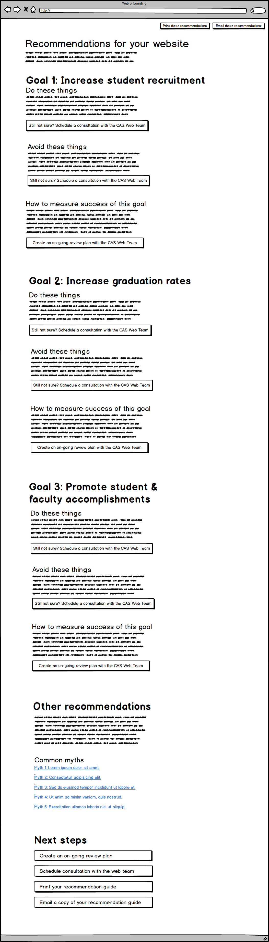
While we typically associate onboarding with orienting new employees, it can be a powerful tool in influencing organizational culture for existing employees when they enter a new role—say, becoming the new owner of an existing website—or when they begin a new project. Good onboarding processes clearly define expectations, roles, and objectives as a way of ensuring employees are performing their jobs well. They can also be a “source of competitive advantage,” due to ensuring “employees have the knowledge and skills that add value to the organization.”[21] In other words, an onboarding process for website owners could help them better define their own website objectives—such as “recruit more graduate students”—while providing targeted education and recommendations based on those objectives—such as “include faculty's research interest areas on graduate program pages.”
Designing and implementing a goal-setting onboarding process is not without its own potential problems. This proposed solution is more akin to a bandaid that attempts to positively influence UNT's culture surrounding its websites without the need for significant additional resources or a restructure of the ecosystem—it does not address:
Additionally, website owners may not buy into this onboarding process if it does not adequately empathize with their motivations and concerns. Even if they do buy in to the process, they may not agree on the proposed goals or recommendations, or they may continue to conflate their own website desires with student needs. Plus, while it would not require significant resources, someone would still need to maintain this onboarding process over time.
There may also be other barriers, objections, or constraints that I have not identified here, given the scope of this research and proposal.
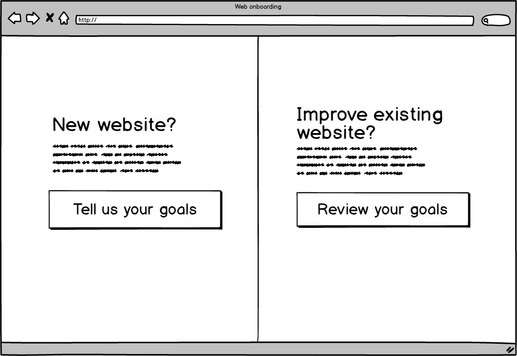
The following low-fidelity screens show the general user flow of the proposed onboarding process. Broadly speaking, the system attempts to figure out where they are in the process of owning a website—new or existing—then gets them to set their academic website's goals. Once goals are selected, the owner is presented with a list of recommendations for each goal with actionable next steps. This low-fidelity prototype was created in Balsamiq.
As the low-fidelity prototype and the overall user flow evolved, I moved onto developing a higher-fidelity prototype in parallel. This forced me to consider the experience of individual screens—how elements are laid out, what actions the copy should facilitate, and how the actual interactions might work in a real system. As this version evolves, it should ideally be tested with both website owners and website editors to pinpoint potential problems with the design.
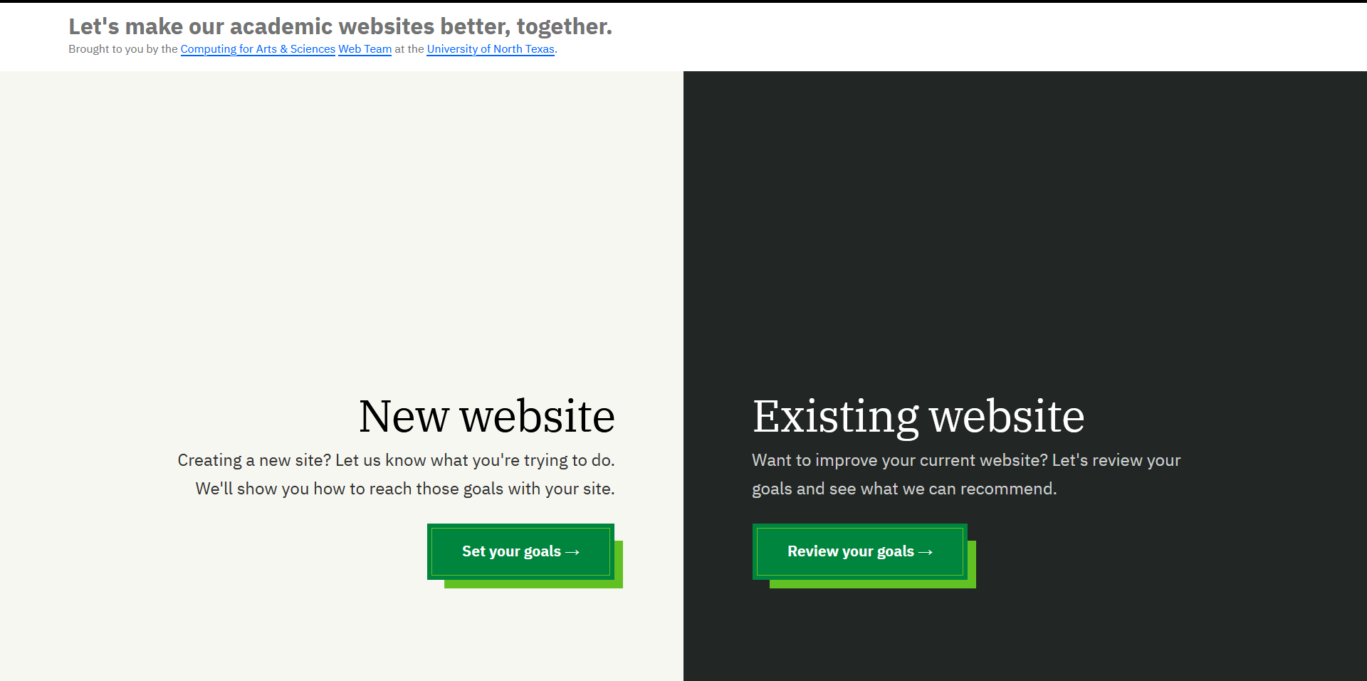
Figure 1 The landing page of this prototype accounts for both new websites and existing websites. The language and layout is simple in an attempt to make it seem easy and quick to do. In future work, separate landing pages for new websites and existing websites could be built to better accommodate each audience.
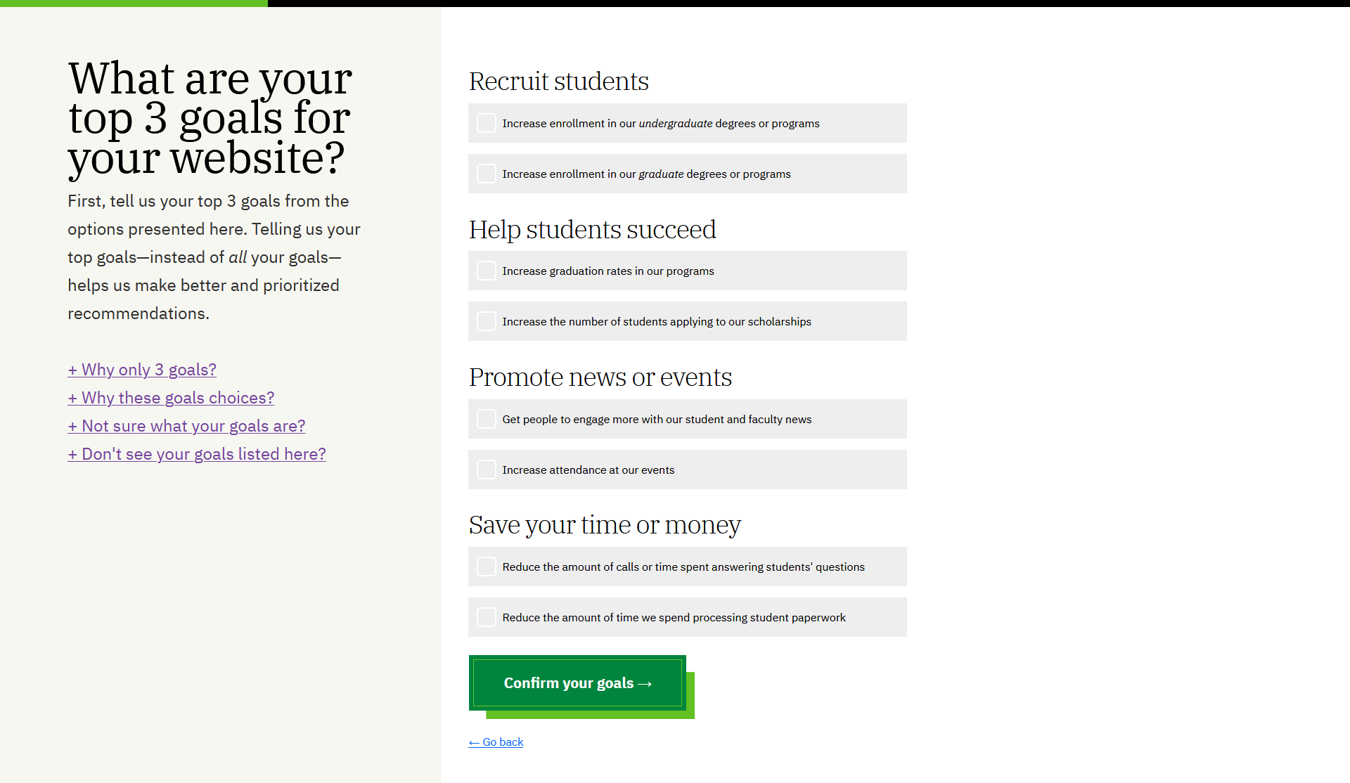
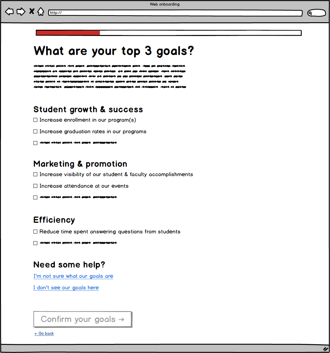
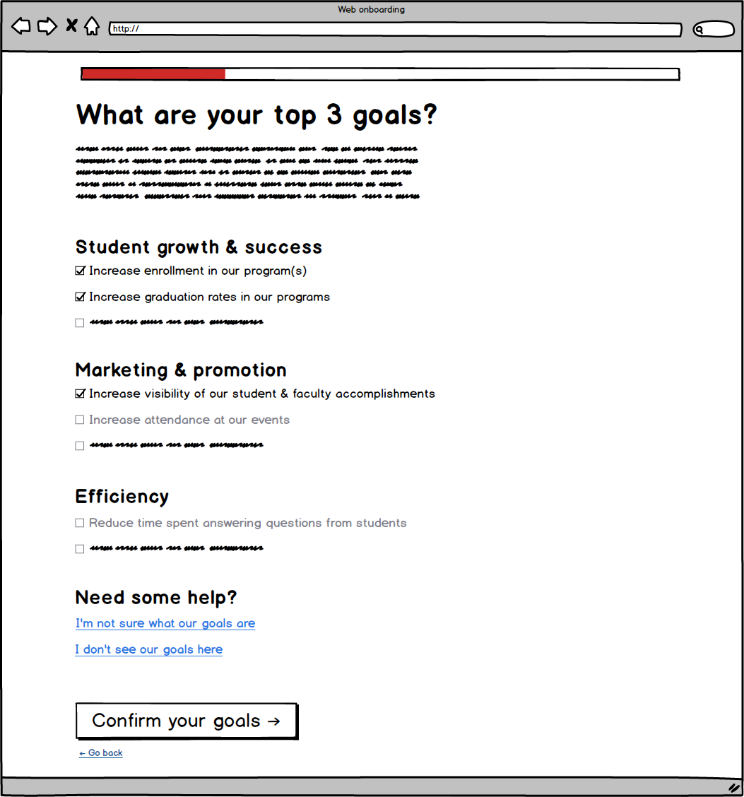
Figure 2 The instructions and form are horizontally divided in an attempt to keep the form the main focus. Goals are divided up into groups with headings to facilitate scanning—and to prime the user to think about their website in the context of common departmental goals instead of what they want it to look like or convey.
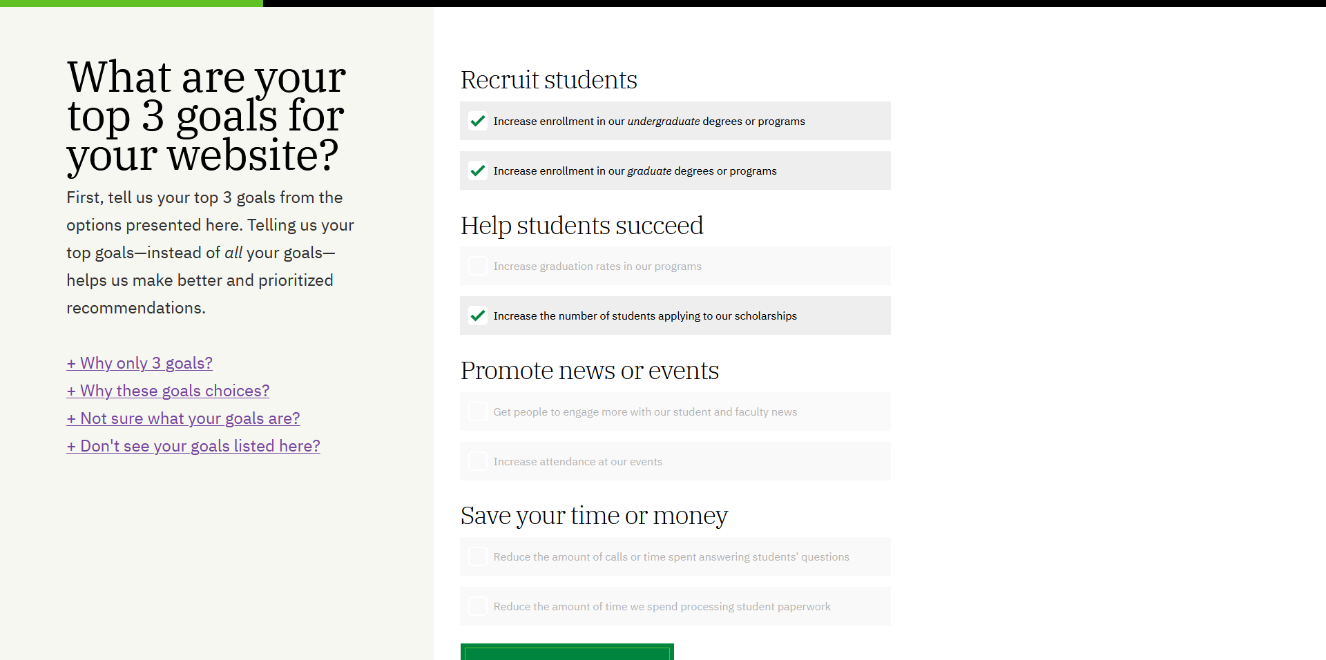
Figure 3 As seen in the low-fidelity prototype, the ability to select goals is limited to 3 choices. The visual and interaction design here attempts to make it clear the choices are limited via greying out and disabling the other options once 3 goals have been selected.
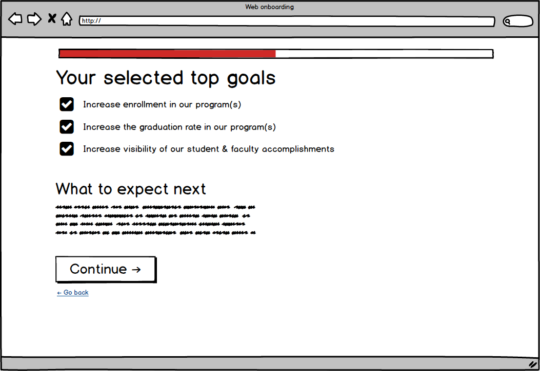
Figure 4 The confirmation page uses the same structure as the goal-selection page to reinforce their relation to one another. It's simple, with plenty of negative space so the focus remains on the goals themselves. Some of the language could be tweaked here to say your instead of our to make the content more direct.
“The right question isn’t ‘Do I like it?’ but ‘Does this meet our goals?’ If it’s blue, don’t ask yourself whether you like blue. Ask yourself if blue will help you sell sprockets.” [22]
This proposal identified reasons that lead to poor university website experiences, and why that matters for both students and universities. It explored the current ecosystem of academic websites at UNT, as well as the major groups within this ecosystem and their relationships with one another. It also identified misalignment of website goals between departments and students as a key factor: departments want to promote themselves, while students want to gather info and complete tasks.
From there, the proposal honed in on website owners as the key group that most influences website purpose, content, and structure within the current ecosystem. Website owners' motivations and behaviors were further explored via two personas that view their websites as promotional channels through two separate lenses—an “outcome-focused” persona and an “identity-focused” persona. The current experience of creating and owning an academic website at UNT was described, alongside missing key actions at each step.
Next, the proposal identified an onboarding-style process as a possible effective approach to improving students' experiences within UNT's existing website ecosystem. While there are potential problems with this approach, it may still help positively influence the culture surrounding academic websites if it adequately addresses website owners' needs, wants, and concerns.
A potential user flow was explored via low-fidelity prototyping that walked through the process of setting goals and receiving actionable recommendations in return. Finally, delving into a higher-fidelity prototype exposed the real-world interactive and content details that would need further research and development.
Michele is passionate about making websites better and increasing design maturity within universities. She currently works at the University of North Texas as Senior Web Manager, leading a team that designs, develops, and administers web services for some of the university’s largest colleges.
Over the last 10 years, she has advocated for accessible, human-centered design for 100+ websites. She has deep experience in multiple aspects of creating websites, including visual design, copywriting, information architecture, front-end development, back-end development, and design research. She also has multiple years of experience in people, project, and stakeholder management.
Michele has a Bachelor's in Information Technology from UNT. She recently completed her Master's in Interaction & User Experience Design, also from UNT, with the intent to make the web a better, more useful place.